Gephi
Gephi is an open-source software for visualization and analytics of social networks . Gelphi uses 3D technologies to display graphs in real time and has user-friendly controllable layout, algorithms, and other tools to analyze social networks
Follow this step-by-step guide to visualize your social network and the slide show
Step 1. Import data from your social network. For Facebook, I found 3 free applications that work quite well: Netwizz and MyfNetwork, GetNet For example, if you use MyFNetwork, save your .gdf file and then open it with Gephi
Step 2. In the Layout Section (on the left), choose Force Atlas from the drop down men. Force Atlas is the function that helps you to find connected nodes and clusters. When you run this function, it pushes unattracted nodes away and it brings attracted nodes closer. Stop this function when you can observe some distinct clusters while less connected nodes fly away. Unfortunately, Gephi doesn't have the undo button so you might need to redo it a few times before you do it right.
*Hint: If your clusters are still "hidden" and not clearly visible, increase repulsion strength to 500-1000 (800 worked for me)
*Hint: If your disconnected nodes fly too far away, increase gravity to 50+
Step 3. Click on the Degree button in the Ranking Tab (--Choose a rank---). Your network degree represents the number of connections you have. In this step, you can choose different layout options to colour your nodes and clusters. Double lick on the triangles along the colour slider and choose your colour or choose a set combination from the palette in the right corner. When you are done, click apply
Step 4. Run some statistics functions to uncover your network properties. How does your network compare to Milgram's network or overall Facebook network? Click run on "Average path length" to uncover your network's degree of separation. Choose "undirected" since your Facebook network is undirected ( you are both friends <->, rather than directed ->)
My network diamater is around 8 with the average path length of 3.5
. You should also see tables for betweenness and closeness centrality distribution of your network
Step 5: Betweenness Centrality
In this step, you will see betweenness centrality of your network. Choose "Betweenness"in the Ranking tab and set appropriate size path by clickin on the red triangle (rather than colour wheel) for your network (such as min=8 max= 40 ). When you click apply, the node sizes will change according to their centrality or importance in your network.
Then, you would want to separate big nodes from small nodes so they do not overlap. To do this, check "Adjust by sizes" box in the layout tab. Can you guess which of your close friends these large circles represent?
If not, use the toolbar at the bottom and click T (turn your labels on) and A (check Size mode & Node Size) and control the font size with the right font size sider and A font options. Now, can you see some very familiar names? :)
Step 6: Detect your Clusters -In the Statistics tab, run Modularity (check randomize), which will colour your "separate" clusters so you can detect groups. This algorithm found 52 communities in my network with Modularity= 0.435.
Now, go to the partition tab and click on green arrows to refresh them.
Then, click on the drop down menu anos choose the modularity class function, which will help you to colour your clusters
*Hint- Right Click "Randomize Colours" if you are not happy with the colours you see
Step 7: Adjustments- Here are some possible adjustments that you can do to make your social network more clear
-In order to get rid of "lonely" nodes that are not very connected, you can do the following:
Click on the Filter menu (beside statistics)-> Topology->Degree range-> In degree range settings, you can eliminate nodes that have less than "n" connections.
For example, if you want to eliminate nodes that have less than 3 connections, drag the cursor to start from "3"
It is also recommended that you adjust your labels again by running "labels adjust function" in the Layout section (left drop down menu) so you can see your nodes and labels better.
Step 8 -You can adjust how your graph works in the Preview option. For example, check "show labels", adjust label font type and size, and click "Refresh" inally, export your graph as a PDF or SVG. Congratulations, you have just visualized your Facebook community clusters!
Below, you can find other useful sources and other pictures of how my network changed.
Sources :
http://www.slideshare.net/persuasion/facebook-network-analysis-using-gephi-11390089
http://forum.gephi.org/viewtopic.php?f=7&t=1383&
http://www.slideshare.net/sociomantic/facebook‐networkanalysis‐using‐gephi‐3996673
http://gephi.org/2011/new‐tutorial‐layouts‐in‐gephi/
http://www.slideshare.net/persuasion/facebook-network-analysis-using-gephi-11390089
http://forum.gephi.org/viewtopic.php?f=7&t=1383&
http://www.slideshare.net/sociomantic/facebook‐networkanalysis‐using‐gephi‐3996673
http://gephi.org/2011/new‐tutorial‐layouts‐in‐gephi/
Interpreting Social Network Graphs
I learned 3 major things from visualizing and analyzing my social network:
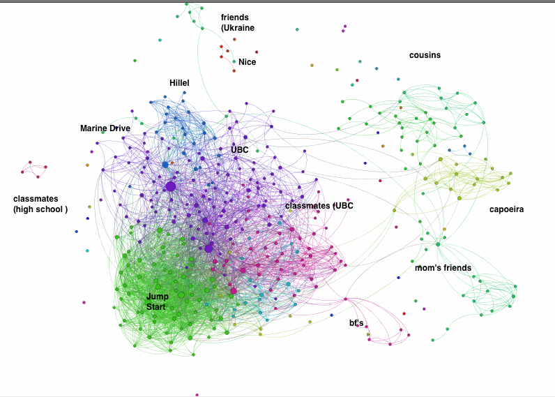
1. I have a few important central nodes and connectors. For example, I have 68 common friends with my best friend
2. I have a large community of UBC friends and smaller communities within this network. For example, I have friends from Jump Start (leadership program for 1st year intl students), friends I know from Marine Drive, classmates, UBC clubs and other communities within my large UBC cluster.
3. This graph helped me to easily detect outliers and people I don't have close connections with
(Perhaps, I know how to easily clean my Facebook friends now?)
Also, as recommended by Salima, I asked one my friend to give me access to his data so we can compare our networks.
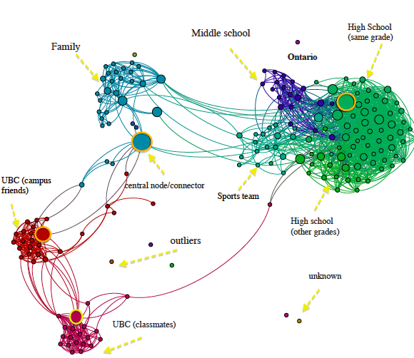
He was born and raised in Ontario so it is not surprising that he has a large network of people he knows from high school and middle school. In contrast, I have less than 5 friends from high school on my facebook (I use vk.com to keep up them)
Fortunately, he does not have many friends on Facebook so it was easier to analyze his network and to see distinct clusters. He has two major UBC clusters that consist of people he met when he lived on campus for 3 years and people in his program. He also has two central nodes, one of which is a social connector to his UBC friends, high school friends, and family.
He was surprised to learn that he has very distinct clusters in his network and he still keeps in touch with the majority of his high school friends. In contrast, my network is largely composed of UBC people and various communities within the UBC cluster. Also, my friend found that he has many "outliers" or unconnected nodes that turned to be people he does not even know that he probably added accidentally long time ago. So social networking analysis can also be a quick and easy way to clean your network!
Follow the slide show below with beautiful graphs to see how I arrived at this graph of my friend's social network: